How to spot a crappy self-published book (and make sure yours isn’t)
Here’s a syllogism for you: A book will boost your reputation. It’s easy to self-publish a book. Therefore, a self-published book will boost your reputation.
Not so fast.
The problem is, most self-published books reveal themselves to be crappy and do more harm than good.
Self-publishing is faster than working with a traditional publisher and cheaper than hiring a hybrid publisher. Working with services like Kindle Direct Publishing and Ingram Spark, you can get a paperback book up where people can see it and buy it, faster and at lower cost than any other publishing method. But will that book broadcast that you’re smart — or that you’re a fraud?
To help you avoid coming off as a fraud, I’ll walk in sequence through the places your potential reader will get an impression of you, describe what reveals a book as crappy at each of these decision points, and explain how you can avoid each of these pitfalls.
0 The title
Yes, I’m starting this list with item zero because that’s how important the title is.
Odd and intriguing titles are fine. Bizarre titles that make people question your sanity are not (How to Raise Your IQ by Eating Gifted Children, anyone?)
A useful nonfiction book also has a subtitle that explains why it exists. I like Clarity Wins: Get Heard. Get Referred, for example.
If you’re an expert, you can’t go too far wrong with “How to . . .,” either in the title or the subtitle.
1 The Cover
Here’s a passel of self-published books. Which ones would you like to pick up and read?
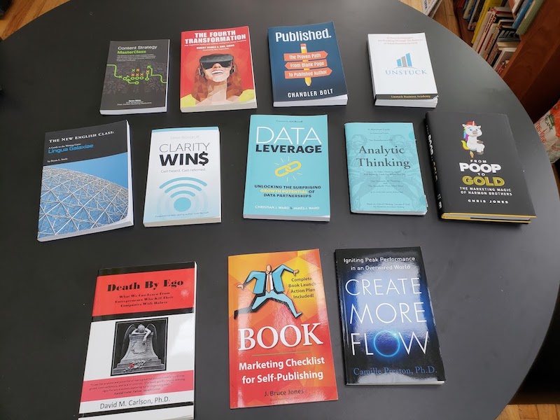
There are plenty of useful cover design principles, but knowing them won’t make you into a graphic designer. Hire a cover designer. For less than $2,000 you can get an excellent cover.
You want the cover to look good both in the reader’s hand (say, when they get a copy at an event) and when the image is an inch high on an Amazon page. The latter is more important. So use big, clear type for the title.
2 Amazon reviews
If you’re writing a book, you might see this as an afterthought. It’s way more important than that. The first things your potential reader will check out on your Amazon page are the reviews. If your book’s any good, the ratio will be healthy (at least 80% 5-star reviews), but the bigger question is how many there are.
Which of these books would you trust enough to read and buy?
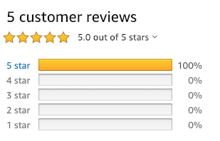
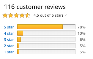
I worked on both of these books. They’re both excellent books. But the folks working on the top one didn’t do enough to solicit advance reviewers to generate momentum.
3 Marketing copy and blurbs
Lame marketing copy and a lack of blurb quotes marks a book as a do-it-yourself effort. And they’re easy to fix.
Real books have marketing copy that sounds clear and definitive and persuasive, but not like a carnival barker. That copy appears (or ought to appear) on the book flap or back cover as well as on the Amazon page.
Just because you’re a good author doesn’t mean you’re good at marketing copy. So hire or beg somebody who’s good at that to write the marketing copy, based on a first draft you write yourself.
Similarly, you add credibility with a few quotes from prominent people — CEOs or other authors. If you have friends like that, you want to get them prerelease text of the book months before the pub date and secure their quotes. Often, they’ll even ask you to draft something for them to say.
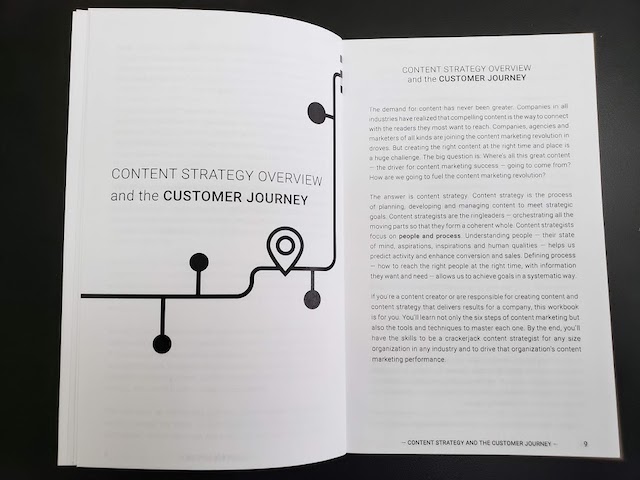
4 Interior design
No one believes me when I tell them the number one way people spot a crappy self-published book.
It’s the margins. They’re too narrow or too wide. Or they’re too symmetrical. Real books have wider margins in the center where the pages are bound (the “gutter”) and narrower margins at the edges, so even and odd pages are styled differently.
Another dead giveaway: bad fonts. Sans serif isn’t the right choice for blocks of type — it’s hard to read. Funky fonts mark you as an amateur. Which of these books like professional to you?
This?
Or this?
Leave the sans-serif for the headings.
Better yet, hire a professional designer. Steve Woodruff, author of Clarity Wins, hired Kelly Exeter. Robert Scoble and Shel Israel worked with Shawn Welch on The Fourth Transformation. Andy Sernovitz, author of Word of Mouth Marketing, swears by TLC Design. Just hire somebody who’s done a good job on somebody else’s book.
5 Flawless writing
Start reading. If you come upon typos, factual errors, text in bold instead of italic, or any of a countless number of other gaffes (like too many exclamation points), you know you’re reading a cheaply produced self-published book. The brow wrinkles, the corners of the mouth turn down, and you think, “I would never work with this guy, he’s sloppy!”
Luckily, this is easy to fix. Get a copy editor.
A typical copyediting job from a professional is going to cost less than $1,000 for a whole book. It’s worth it.
And remember, the copy editor’s job is not to turn your crap into valuable worthwhile prose — for that you’ll need a content editor. The copy editor is there to turn finished prose into perfect prose at the very end. Listen to what they say and you’ll avoid looking sloppy and borderline illiterate.
6 Ebooks and audiobooks
A real book is available in both print and ebook format. Your book design person, if they’re any good, can create the print design and then format the same text as an ebook.
You don’t need an audiobook, but having one adds credibility. All it takes is a few days in the studio with an audio editing professional, if you’re a decent out-loud reader. Or hire an actor.
7 An author web site
It’s great to have a Facebook page, a Twitter handle, an Instagram feed, and a LinkedIn page, but you know what you really need?
A Web site. That’s what people will find if they search for your or your book’s name on Google. It doesn’t have to be fancy. It just has to be there.
The book should have page to itself. And the URL should be something like “bernoff.com/book,” not “squarespace.com/AW24x6Fr0z.”
You know what else is a really cool idea and cheap? Put the URL on the book cover.
8 The other little things
Real non-fiction books have tables of contents.
They have indexes.
They have running heads and page numbers.
They have two title pages: a half-title page where the author signs copies, and a full title page after that.
The book title on the spine is easy to read and goes vertically top to bottom (for books written in English, at least).
If the book has graphics, the graphics look sharp. They’re not straight out of PowerPoint.
Real books have a publisher name on the spine and on Amazon. That publisher might be made up (at Forrester we used “Groundswell Press”), but it’s not “Amazon CreateSpace.”
Yes, these things cost money
There are two kinds of people who self-publish books.
The first kind want a professional product that looks great, is available quickly, and can go on to be popular and spread their reputation as an expert. Those people spend a little money so their result doesn’t look and read like crap.
The second kind just want to say “I published a book.” They spend time on content but not on making a good impression. And their readers, if they have any, are wondering “Why did you bother doing this in the first place?”
Please, if you self-publish, be the first kind of author. Set yourself apart from the crap. Otherwise you’re just wasting your time.
This is a fantastic outline of advice. I hope a lot of budding authors read it and take it to heart.
If a book’s foreword is spelled Forward, that’s a tell. Also, “principle” spelled “principal” or “forgo” (as in do without) spelled “forego.”
Josh, while I agree in principle that a real book is offered in multiple formats, recently I found an unfortunate exception: Joe Moran’s First You Write A Sentence: The Elements of Reading, Writing… and Life (2018) is offered only in hardback…not only by Amazon ( https://www.amazon.com/dp/0241978491/ref=cm_sw_em_r_mt_dp_U_etUzCb4253PK7 ) but by the publisher ( https://guardianbookshop.com/first-you-write-a-sentence.html ). That decision is mystifying … and regrettable. It’s probably one of the most well-written, insightful books on writing I will ever read. Judge for yourself: https://www.theguardian.com/books/2018/sep/21/how-to-write-a-great-sentence?platform=hootsuite
Very strange for a mainstream book to not be available as an ebook.
It’s amazing to me how many people think that Microsoft Word is a design program. It’s a telltale sign of an amateur book.
https://www.motionpub.com/blog/publishing/why-its-a-mistake-to-use-microsoft-word-for-book-design/
I chuckled at the title of this blog post!
The eight concepts announce useful and insightful tips, Josh. Thank you for sharing them. You helped me put words to a number of issues I couldn’t consciously articulate.
Regarding Item 2 (Amazon Reviews): no book is perfect. If 95% or more of the reviews are 5-Star, regardless of the number of raters, I’m immediately suspicious that the author asked their friends, “Do me a favor? Go to Amazon and rate my book 5-Star.” Books with few-to-no review comments: also off-putting for the same reason.
Regarding the font face: I think it’s interesting that the human eye prefers Serif fonts for body text in printed material, yet many blogs use a Sans Serif style including this one. Did you have a conscious reason for choosing a San Serif font for your blog?
What a fascinating question, Lynn. The answer has to do with design for screens and the printed page.
Serif fonts don’t render perfectly on screens, because serifs are skinny little design elements. As a result, for on-screen readability, the best font is often a sans-serif font with a stroke width that’s not too skinny. This varies based on the design and the screen resolution, but if you use sans-serif you can use smaller type and retain readability.
Printed pages have high contrast, are read by ambient light (as opposed to glowing screens), and have a resolution that’s, for the sake of readability at least, effectively infinite. In that environment, serifs make it easier to recognize letters, especially if you’re going to be reading pages and pages of them. This is why long books are typically set in serif fonts.
But the point here is one of convention. A conventional book that’s mostly make of blocks of text is typically set in a serif font. This means your book will look more professional if it looks like those other books. If it’s full of diagrams or carefully laid out graphical pages, you have more freedom, but if it’s full of blocks of text, it will look more professional if those blocks of text are in a serif font.
Question about the font. If I use a serif font like Times New Roman for my printed book, based on what you just said, should I do the kindle/ebook version in a sans serif font—something like Verdana? I had not thought about doing two different versions.
Thanks for your help.
As I understand it, the fonts in the ebook are not under your control. The ebook reader uses whatever font is part of its system.
Wow, I guess I still have a lot to learn. Thanks so much.
How do I get more reviews?
You need to line up people who are friendly to you and ask them to review it. It’s time consuming. It helps if you have a mailing list.
Thanks a lot. I do have a mailing list but never thought of asking my readers to write reviews for the book.
>>…you add credibility with a few quotes from prominent people — CEOs or other authors.
I’ve always thought that reviews from other authors (usually self-published) are dead give-aways of “you scratch my back and I’ll scratch yours”.
But I really enjoyed the rest of the blog. Thanks for the insight.
Hey, if you can get authors like Daniel Pink, Malcolm Gladwell, or Seth Godwin to blurb you, that will add lots of credibility.
Conversely, if you have none, the lack of endorsements stampnds out as a negative.
Does this apply to low content books, like prompted journals? If not, What advice would you offer that is different?