That study about using two spaces after a period? It’s bullshit.
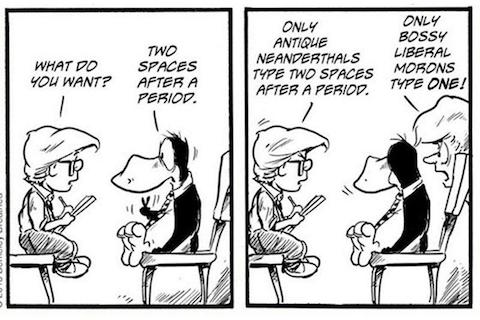
The Washington Post reported on a study showing that adding two spaces after a period improves readability. Now all the use-two-spaces philistines are using this to justify their depraved practices. But the study proves nothing.
Three researchers at Skidmore College, Rebecca L. Johnson, Becky Bui, and Lindsay L. Schmitt, published a paper called “Are two spaces better than one? The effect of spacing following periods and commas during reading,” in the journal Attention, Perception, & Psychophysics. (Psychophysics? Qu’est-ce que c’est?) And, as the Post reported, for some students, reading was 3% faster for writing samples with two spaces after a period.
Here’s why this study is bullshit.
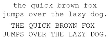
- The study used a monospace font, Courier New. Courier New looks like text from a typewriter; each letter is the same width (as shown below). Monospace text is already hard to read — that’s why we use proportionally spaced fonts in modern typesetting. The readability of monospace text with two spaces is irrelevant; in 2018, nobody reads text like that except typewriter fetishists.
- The lines of writing were quadruple spaced. Reading with extra vertical space between lines of text is not a typical reading experience.
- The students had their heads clamped in place. That’s not how people actually read — their heads move.
- There were only 60 students. A difference this small isn’t significant in a sample this small. Furthermore, undergraduates are not representative of the whole population with its diverse ages and levels of education.
- The advantage was only visible for students who normally typed two spaces after a period. Of the students, only 21 typically typed two spaces after a period. The 3% increase in reading speed was visible only among this small group of biased and befuddled students. For the remaining, enlightened students who used one space, reading was actually slightly faster in the one-space sample.
- The text wasn’t on a screen. While the reports on this study didn’t indicate for certain, it seems like the people in it were reading printed material. In real life, these days, people read from a glowing piece of glass. (That’s how you’re reading this, isn’t it?)
- Reading speed is not the best measure of text quality. I’d like to know if the reading comprehension was different, for example.
As a result, drawing conclusions from this study is irresponsible. It proves nothing. (Unless you are an undergraduate student who types with two spaces and reads your text in quadruple-spaced, monospace font with your head clamped in place — if that’s you, then by all means, demand two spaces in what you read.)
How we got to the one-space world and why we need to stay there
I’ll narrate this history with some personal notes.
Until typewriters, printed type was proportionally spaced. That’s what you read in books, magazines, and newspapers. My grandfather, who was a linotype operator, used to bring home slugs of lead type from his job. He showed us a block of headline type with our family name on it, but reversed mirror-style; you could press the block on an ink pad and print your name in big type on a piece of paper. I thought this was the coolest thing ever.
Typewriters, of course, created uniformly spaced print. They allowed ordinary humans to create and distribute type, but it was instantly recognizable as different from professionally printed material. Typewriters were the first step in democratizing the creation of printed material, since you could create and distribute your own text. Technologies like ditto masters (which smelled like a distillery and printed type in blue) and mimeograph machines made distribution relatively easy. Then xerography came along and you could copy and distribute anything cheaply.
Those of us who are old enough to remember typewriters learned to use two spaces, because in a monospaced font, that enhances readability. There is so much space between the letters already that you need extra space to cue the eye and the brain into where the sentences stop.
This convention got trained into our brains and our fingertips, and persisted in the early days of word processors. That’s because early word processor screens could only handle monospace displays, and because dot matrix and daisy wheel printers would print that type in a similar way, with all the letters the same width.
The Macintosh, and later Windows, introduced us all to bit-mapped screens. These allowed you to see on the screen what you’d get when you printed something out — WYSIWYG, or What You See Is What You Get. At first this was a curiosity, but rapidly, anyone who wrote needed to learn all the stuff that professional typesetters had been dealing with — fonts, font sizes, serif and sans-serif, fully justified blocks of type, and, of course, proportional spacing. Now tiny children first learning to type know what fonts are.
Once the world of writing and the world of professional type merged, it was inevitable that the conventions of good-looking printed text would win. Among those conventions is using one space after a period, because in a proportionally spaced paragraph, unlike a typewritten one, the spaces stand out clearly from the rest of the close-set type.
Those of us who learned the double-space convention from typewriters needed to learn to adjust to the new world. Since I was one of the first to adopt desktop publishing in my role as a professional technical writer, I adapted. I learned the two-space method on a typewriter in a high-school typing class in 1974, unlearned it as a professional writer creating type for printing in 1980, and fully embraced the proportional type, one-space-after-a-period-dammit world of desktop publishing in 1986.
I know that mobile phones put in a period for you automatically if you type two spaces. That’s nice. But they don’t show two spaces, they show only one.
This is no longer a question of taste. It is a question of convention. If we put all type in 16 points it would be more readable, but we don’t, because smaller type is conventional. It’s conventional to use proper grammar. It’s conventional to use italics for emphasis and underlines for links. And it is now a widespread convention to use one space after a period. Yes, it is better. But more importantly, it is now a standard, and standards are how we can all work together.
The 1970s were nearly 50 years ago. Give it up already. We live in a proportionally spaced world, for writing, printing, and reading on-screen. My grandfather was decades ahead of his time, but the world of type he lived in is now the world we all share.
So enough with the reactionary two-space thinking already. And if this study is all you’ve got going for you, that’s just sad.
Yes! After reading this study I had to go back and see for myself what I did naturally when typing on the computer. And it was natural to just hit the space bar one time after each point of punctuation. I think surely most of us “do one space” after a period without even thinking about it; especially if we are on the computer all day long! (who isnt these days?)
Fun read – love the history – and I also find it annoying that my son will spend hours playing with fonts rather than just typing his damn paper! 🙂
You can take my second space over my dead body. But I did like your comment “conventional to use proper grammar”. Tell that to all the “exact same” people.
But seriously, what about her emails?
Back in the typewriter days, I had secretaries and they did all my typing. I never noticed whether they used one or two spaces. Nor did I notice that in any of the MANY documents, briefs, memos and letters I had to review. I do not recall being taught in law school about this, although we had to learn very specific punctuation for case citations. Once I started using a computer and doing most of my own typing, I used one space and still do. I still do not notice what other people do. That there is a dispute about this seems bizarre to me. I think it is fine either way.
Thank you Josh!!! Like you, I am old enough to have worked first on a typewriter and then had to adapt to a computer. I am forever removing that extra space in copy I edit. Extra Space R.I.P.
I use two spaces, quite unconsciously.
Old dog, old tricks…
Can I get rid of the extra space in a book-length manuscript using the “find/replace” function, or will that land me in trouble?
Yes, that should work. As always, safest to work on a copy when doing something global.
Thank you, Mitchel. Gulp. Here goes…..
You tell ’em, Josh!!!
Sorry, but I’m a Philistine. I find that, irrespective of font face or medium, a 2-space sentence differentiation is much easier to read and parse. I don’t like reading Faulkner – takes too much in the way of mental gymnastics to find where one thought transitions to another without punctuation. The same, in my opinion, can be said for the “extra” space used to differentiate thoughts.
Perhapsourcollectivestyleneedstobeauniversaljoinofeecummingandwilliamfaulkerwhowhenjoineduseneithercapitallettersnorpunctuationandifspacesareaformofpunctualtionthenwhydoweneedthoseatall
Oh, the anarchy!
Wow, Tim E. Your extra-long word-salad took your comment right outside of the box!
Josh, I love the phrase: use-two-spaces philistines.
Such problems! It will all soon be moot. We will be reading text on our smart watches (or projected onto our corneas) using Spritzinc.com technology.
Your story made me laugh, remembering when the digital natives in my office couldn’t comprehend a graphic from a local printer (keys from a manual typewriter).
That said, breaking the 2-space habit was difficult for me, but nothing compared to typing on a small screen with two fat thumbs. Also, still getting used to the fact that people would rather text than phone. But, I’m evolving… (said with waver in voice). Get Off My Lawn, and all that…
Ditto masters. Aaahhhhh! (breathing deeply)
Your first section — in which you dissected the many flaws of the study — is an object lesson in critical thinking. A+
In Miss Brulte’s Personal Typing class in 11th Grade at Upper Dublin High School, she always told us to hit the Space bar twice after the period. I’ve been doing that now for 44 years. In fact, when I copy a document off the web, or sent to me as an attachment from an email and paste it to a Word file, I always go through it and add an extra space after each sentence if it is not there. I have found that this does make it easier to read sentences within a paragraph.
I totally agree as I had a similar journey from manual typing to desktop publishing. I had to unlearn the two-space convention. One other element few mention is that publishing software takes advantage of the space character to add or subtract space to minimize hyphenation as well as for justification of text. It can compress or expand text subtlely within spaces on a line. Adding an extra space can throw the software off. (Older programs were notoriously bad at it.)
The oldest .txt file I have on this computer (and all .txt files are in monospace) is the paragraph below – it was cut-and-pasted from an email I sent to a friend prior to departing for the back-blocks of India in 1998, and which I kept with an eye on developing it into a business idea for using video over the Internet as a more effective and efficient means of communication for businesses. Not only was I using two spaces after a full stop (what we call a period in the English-speaking world) back then, but I was spelling email with a hyphen!
“My foreign postings may force a regression to semaphore or even smoke signals, slow serial text-only connections if ever there were. But it occurs to me that the computer revolution and fibre-optic/cellular telecommunications are on the brink of making text itself obsolete, of making written language a thing of the past. Today video e-mails, tomorrow video everything — all news, all communications, all records, all information, all literature, all culture, the world on your Dick Tracy watch. The descriptive power of language, once essential to communicate over distances, will be at best a commentary accompanying the immediacy of visuals, a soundtrack to a video society. Fast-forward, anyone?”
More like emojis, Greg. (Ah, the Dick Tracy watch!)
Go ahead! Type two spaces after a period. It makes you look a bit clueless, but that’s your prerogative. However, if you’re typing material that’s going out to the public, then some designer, marketer or web person is going around after you replacing all your double spaces with single spaces. Do you really need to make their lives more difficult in order to coddle your typographic iconoclasm?
Mitch,
I wish this site’s commenting system provided a “Like” feature so I could upvote your comment.
I’ve deleted a lot of double spaces in my time!
This is all fine and good, and I don’t necessarily disagree as it describes an internal debate that I’ve been having for the past several years. My issue is one of pre habit. If you can provide an easy and foolproof way to keep my thumbs from double taping while typing, then I’m happy to convert. But at this point (the single spaces here were effort spent) after also having learned to double space WAY back in the day on a typewriter, the double tap is so autonomous that attempting to correct a document would so greatly impact the duration needed to write anything that I just let the habit ride.
Plus, hey; it’s apparently keeping a lot of designers, markers, and web people in a job! LOL
I will say that juvanille name calling and bashing will not win your ‘opponents’ over much, if at all; especially when compared to actually building a functional case instead of a poke disguised as a history lesson. Maybe there’s a business opportunity to help folks like me kick the habit! Haha! (see what I did there? hehe)
I HATE autocorrect!
tapping… not taping
marketers, not markers…
ugh!
Chuck,
In WordPerfect and FrameMaker, if you so wish, the program will insert only one space after a period no matter how many times you press the spacebar. In Word, your only option is to see a blue squiggle to remind you to delete the second space.
And I hate commenting systems that won’t let us correct a typo after we post! 🙂
I am a professional copy editor. The easiest way I have found to get rid of extraneous spaces is with an app called Text Soap. It would be better if people did not type them in the first place.