Why all this talk about the “median” income?
The US Census Bureau released figures yesterday showing that, in 2015, the median annual household income in America increased by 5.2% over a year earlier. That’s an increase of $2,798, to $56,516 per year. Why talk about the “median” and how is that different from an average? I’ll explain.
Put simply, when you’re talking about income, the mean is the average income, and the median is the income of the average family. Those are not the same thing. Medians don’t jump around because of change at the extreme end of the spectrum, and that’s why, if you only have one number, the median is more representative. Let’s see why, with a couple of illustrative examples and then a closer look at the US economy.
In Uniformia, means and medians are equally revealing
As a thought experiment, let’s examine the pretend country of Uniformia. There are only nine households in Uniformia, and here are their incomes from 2014 (Uniformia happens to pay people in US dollars; it’s too small to have its own currency):
Uniformia income distribution 2014
$20,000
$30,000
$40,000
$50,000
$60,000
$70,000
$80,000
$90,000
$100,000
The mean income in Uniformia is $60,000 — just add up all the numbers and divide by nine. To get the median income, you sort all the numbers in order (as I did) and then pick the one in the middle. In this case, that middle household is making $60,000, the same as the mean. So in Uniformia, the mean and the median are the same. This happens when the distribution of incomes is balanced, as it obviously is in this example.
Now the census bureau of Uniformia has a very easy job — it just asks each of the nine families to submit their income. When they did this in 2015, it turned out that everyone’s income went up by $2,000, so the new income distribution looked like this:
Uniformia income distribution 2015
$22,000
$32,000
$42,000
$52,000
$62,000
$72,000
$82,000
$92,000
$102,000
Now the mean is $62,000. The mean is nice and linear — if everyone gets a $2,000 raise, the mean gets a $2,000 raise. The median is now $62,000, reflecting only that one family in the middle. (You might think that the median, depending on only one income, would be sensitive to lots of variation, but that becomes less true the more numbers are in the distribution).
In Extremia, more variation means medians are a more representative
Right next door to Uniformia is the country of Extremia, which also has nine families. But there are a couple of rich families in Extremia, so it’s not distributed so evenly as Uniformia. Here’s the list of 2014 incomes in Extremia.
Extremia income distribution 2014
$20,000
$30,000
$40,000
$50,000
$60,000
$70,000
$80,000
$190,000
$900,000
The mean income in Extremia is $160,000. Right off the bat, you see how the mean gives a distorted picture of what’s going on. The outliers — the two rich families — drag the mean way up. The median, though, remains at $60,000, since it’s not affected by outliers. Basically, the mean reflects what’s going on with all the money, while the median reflects what’s going on with the single family in the middle.
The two rich families in Extremia found gold on their properties in 2015, so their incomes went way up. (Isn’t it always the rich ones who get lucky?) Everyone else got a $2,000 raise. Here’s the income distribution of Extremia in 2015:
Extremia income distribution 2015
$22,000
$32,000
$42,000
$52,000
$62,000
$72,000
$82,000
$592,000
$1,402,000
So what do the statistics say now? The mean income in Extremia went up from $160,000 to $262,000 in 2015, for an increase of 64%. So, is it accurate to say that incomes in Extremia went up 64%? I think the other seven families would disagree. The median, however, went up from $60,000 to $62,000, or a 3% increase. This doesn’t reflect the gold rush at the top, but it’s a more accurate reflection of the situation of a typical family.
America looks a lot more like Extremia than Uniformia. That’s why the median is a good reflection of what’s going on. A 5.2% increase means that average families are doing a little better, which hasn’t happened so much lately. And it’s not distorted by some guy at Goldman Sachs who just got a big bonus, or for that matter by a bond trader in the Hamptons who just went bankrupt.
To really understand distributions, you need more than one number
One statistic can only tell you so much. What’s happening throughout the income distribution? One way to look at that is through quintiles — groups that each contain one-fifth of the households. Here’s a chart from the Boston Globe (only in the print edition, strangely), that shows how the income quintiles in the US did in the last year:
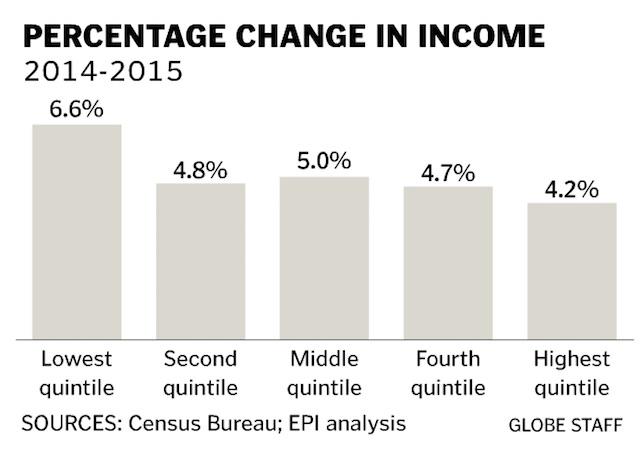
You compute the quintiles just as you do the median: sort the household incomes from highest to lowest, then divide them up into five equal-sized groups. This chart shows that the average income of the bottom fifth of households increased by 6.6%, while the average income of the top fifth increased by 4.2%. For once, the gains are going proportionally more to the bottom than the top. (In absolute terms, of course, the people at the top still do better, because a 4.2% raise on $200K is six times as large as a 6.6% raise on $20K.)
Finally, I want to give some credit to the Wall Street Journal for this chart which shows what’s going on for income in some other groups:
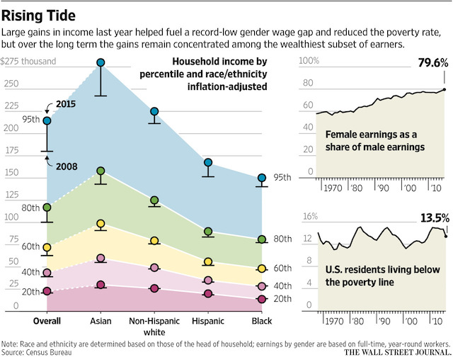
Spend some time with that and you get an indication of the where the boundaries are for the quintiles, how things have changed since 2008, which races are doing best, how female earnings are increasing but still lag male earnings, and how the poverty rate is down, but still includes one in eight households. That’s a lot to learn from one chart.
And it makes it very clear, with the blue area, that the people at the top are still getting the lion’s share of the gains, even if the people at the bottom are doing a little better.
Don’t settle for one number, or you’ll miss insights like this. But if you have to use one number — and if the distribution has extreme values, as with incomes or home prices — the number you want is the median.
Thanks for the explanation! As someone without any statistics training, it helped me understand the difference between mean and median very easily.