Hall of shame: Fixing Cooperstown’s disastrous typography
The Baseball Hall of Fame in Cooperstown, New York just added plaques for some new members. And they’re terrible.
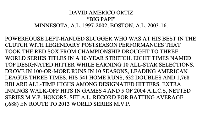
Here’s the new plaque for David Ortiz, a player I revere.
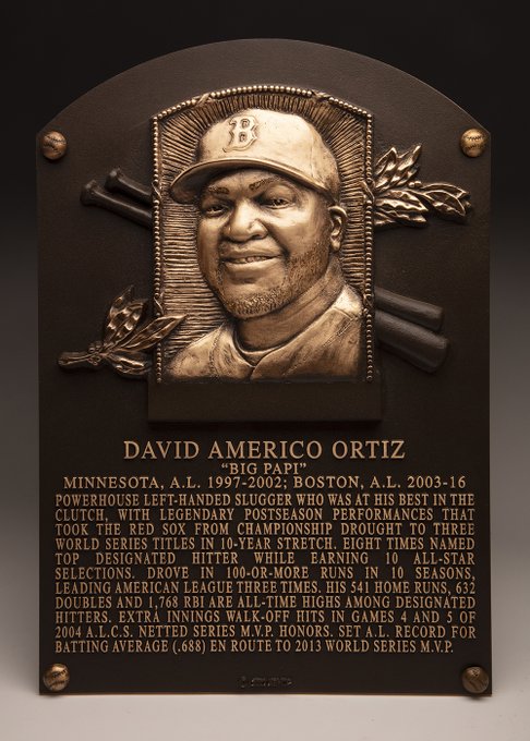
Why this typography is all wrong
I’m no designer, but like all real writers, I care enough about type to know what works and what doesn’t. So I’ll provide a simple explanation of what’s wrong here, why it’s wrong, and how they could fix it.
These are the decisions that the Hall of Fame made regarding typography and the reason that they combine to create a serious readability problem:
- Contrast. Light bronze letters on a dark bronze plaque is low contrast, and it will get worse over time as the metal tarnishes. This problem is inherent in the nature of the plaque, but the low contrast exacerbates the rest of the problems.
- All caps. Type set in all caps is more challenging to read because it’s harder for readers to identify words by shape, since every word is a blocky rectangle. It’s certainly possible to create metal plaques with lowercase letters — check most roadside historical markers, for example — but the Hall has made a choice to use caps to make this seem more “permanent,” like an inscription carved in stone.
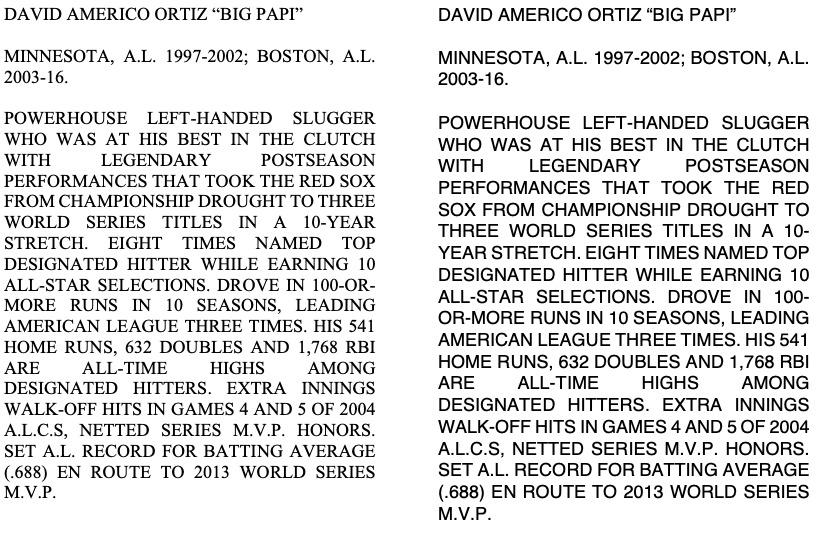
- Serif font. Serif fonts are generally more readable than sans-serif. But that property reverses when the font is in all caps, because we’re not used to reading a bunch of all caps serif letters in a row. All the serifs on the capital letters catch the eye and create distraction, impairing readability. See for yourself — both samples below are 10.5-point type, one in Times New Roman (serif), the other in Helvetica (sans-serif).
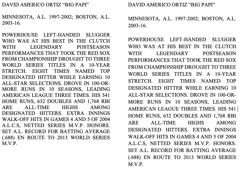
- Leading. When readability is an issue, you can improve it by increasing the “leading,” (rhymes with “bedding”), that is, the amount of space between lines. The lines of type here are set pretty close together, with the space between lines about 10% of the height of the type. Twice that would make the type easier to read. Take a look:
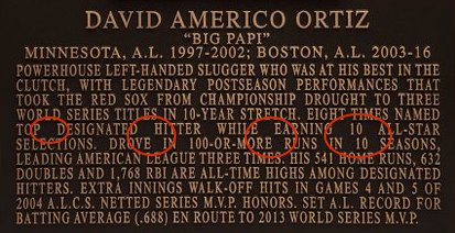
- Full justification. Finally, and perhaps most importantly for readability, the Hall has chosen to set the type fully justified on both sides. This is an appropriate choice for a sequence of wide paragraphs as in a book, but not for a single narrow block of type like this. This type is a relatively narrow column, with room for only about 35 characters per line. When you fully justify type like this, you get big gaps and holes on some lines and crowded type on other lines, as I’ve highlighted in the first image below. A better choice would be left-justified, ragged right, which keeps the letter spacing consistent. The second sample below shows approximately how the type would look if were set this way.
How did this happen?
In a word, history. The plaques look the way they do because they’re attempting to be consistent with plaques for players from an earlier era.
Take a look at the plaque for the immortal Ty Cobb, who played at the turn of the 20th century.
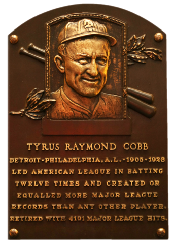
The type is still in serif font, all caps, which was likely the style of all such plaques at the time. The artisans who made this plaque would never have considered lower-case letters or sans serif. While sans-serif lettering became common in the 20th century, it certainly wasn’t typical for this type of ornamental application. It’s possible that capital letters in a serif font were all they had readily available in the foundry for use in plaques of this kind.
Note, however, that this description is far shorter, even though Cobb had a longer and more significant impact on baseball than Ortiz did, including the all-time record for hits that stood for many decades. As a result of the shorter description, there’s room for more leading, which improves the readability. And the centered block of type, like ragged right and unlike fully justified type, avoids the gaps and uneven spacing in the modern plaques.
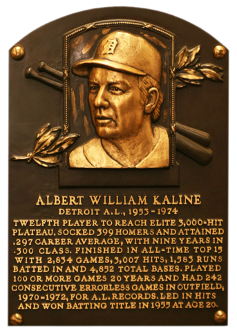
Not surprisingly, more modern plaques include more detailed descriptions. But some avoid some readability problems by eschewing full justification. Al Kaline’s a lot easier to read than David Ortiz’s.
What the Hall of Fame should do next
What changes to the typography on the plaques would improve readability without doing violence to consistency and to history — which is, of course, what the Hall is about?
Certain things shouldn’t change. The plaques must retain bronze type on a bronze background. And I think it would be too jarring to switch to lowercase letters now — the new plaques would just look too different from the old ones. We’re probably stuck with all caps for historical reasons.
As you can see from the Al Kaline plaque, there is no reason to continue with fully justified type. Ragged right would work just fine, but if the Hall wants to use centered type that’s ragged on both sides, I doubt anyone would find it a jarring transition. If the new plaques look like Al Kaline’s, they’ll fit in just fine.
The other change I’d recommend would be to switch to a sans-serif font, and a choice that’s a little more space efficient than the serif typeface they currently use. Slightly more efficient type would allow the same length descriptions to take up less room, and if we could save one line per plaque, we could increase the leading by spreading that space out vertically between lines of type.
Centered, sans-serif type with better leading would be easier to read, but sufficiently consistent with previous plaques that no one would find the change jarring. Change is about balancing new knowledge with tradition. These changes would do that. They’d allow visitors to soak in the rich history of baseball without getting a headache trying to read about it.