How to talk to a graphic designer about book covers
I’ve been working with designers for many decades. I have no graphical talent, and counterintuitively, that’s one reason why I’ve been successful in getting some amazing designs. Great designs emerge from a graphical mind; your job, as the client, is to provide the inspiration, not pick colors or icons.
When you’re working with a good designer on an iconic design, such as a logo or book cover, here’s what you should do:
- Tell the designer what emotional words you’d like to communicate, such as “bold,” “friendly,” “shocking,” “buttoned-down,” or “playful.”
- Don’t talk about graphical elements. Don’t say that you’d like it to be white with a flower, or in Bodoni Bold, flush left. Let the designer use their design skills. They have the training and tools to speak this language; you don’t.
- That said, you should indicate what anything that you’d reject: for example, no fluorescent colors, or don’t use my photo.
- When you review design suggestions, your first impression matters. But get other people’s opinions, too.
- Finally: don’t crowdsource graphics. Your friends will have lots of suggestions, and the sum-total of those suggestions will not hold together in a coherent design. It’s appropriate to ask the crowd “which of these covers do you like,” but not “how should I fix this?”
I’ll show some examples of this in action: the covers of books that I’ve worked on.
Writing Without Bullshit
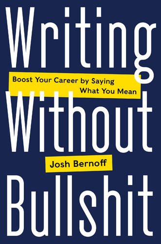
Here’s the cover of my new book, which will come out in September. Here’s what I told the publisher regarding the cover:
Emotionally, our biggest problem will be people thinking this is a joke. I want to get people to think of this book as bold, useful, and provocative. And a little fun, but not a joke.
Your “Leadership BS” cover is in the right direction, at least as far as graphical tone goes.
Now I will break my own rule and talk about graphics. I think we can all agree that there will be neither bulls nor shit on the cover. My face will not sell books, either.
Let’s not get cute with the Bullshit either, as they did on the cover of “Go the F**k to Sleep.” If you’re offended by profanity, you won’t buy this book, regardless of the cover. So let’s own the world Bullshit and make it work for us. Here are some examples of people who did that successfully:
I know [you] had suggested putting the word “Bullshit” in script to sort of get you to take notice and play against expectations. I’m not a fan of that approach, I’m afraid. I want people to notice the word.
Also, I have future books planned that will include “Without Bullshit” in the title, so I’d like that pair of words to have some graphical unity that could connect to a word other than “Writing.”
I quickly accepted the publisher’s cover design, which rarely happens. I like the bold contrasts and the tilt of the panel with the subtitle. As far as the word “bullshit” goes, I like that we’re not coy with it, but we don’t play it up either: it reflects my attitude that we’ll deal with bullshit directly and without flinching.
My only graphical instruction was to avoid literal pictures of bulls or shit, which would have made the cover less than serious. They agreed. One source of the success here is that my editors and I had had many discussions about the book and they’d seen much of the text, and this allowed them to work effectively with their designers on a design that worked.
Groundswell
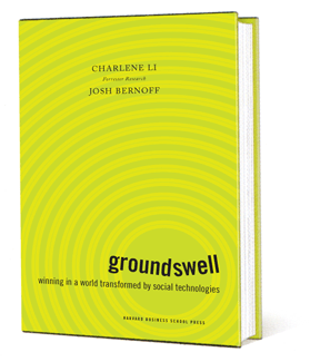
We got this cover from the amazing HBR cover designer Stephani Finks. I sat with Stephani and talked about the book for about half an hour, and she used the ideas from that talk to design the cover.
What I love about this cover is the asymmetry, the uneasiness it creates. It suggests an earthquake without cliches like a crack in the ground. Putting the title in lower-case, bottom right, and broken in pieces, grabs your attention. If you tell designers what pictures and colors to use, you’ll never get to see something like this.
Charlene and I studied a bunch of covers before we talked to the designer, and were very attracted to the sparse, plain white covers like “The Tipping Point.” Luckily for us, Stephani paid attention to our ideas (a seismic shift in how the world works) instead of our pedestrian design ideas.
Here’s what happened when I first saw this cover. Stephani sent me a file and for whatever reason, it was zoomed way in on my screen. I saw only the field of yellow and green. And I was repulsed. I was convinced it was awful.
Charlene liked it, but said “Hey, if you hate the cover, then we can’t use it.” But then I showed it around to a bunch of people and everyone liked it but me. Eventually, I realized I was wrong. And now I think it’s great.
Empowered
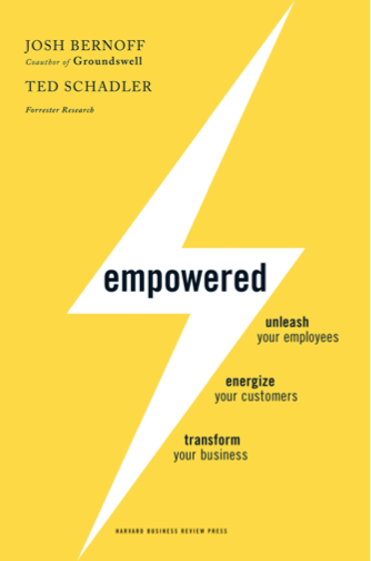
This is another HBR/Stephani Finks cover. We wanted it to match Groundswell stylistically. That’s why she chose the bright yellow, graphical treatment. Again, the stylized lightning bolt suggests the idea of empowerment without being too literal.
The process for this was similar to Groundswell, but Stephani ended up giving us two choices. The other one was stylized superhero with a cape flying left-to-right above the word “Empowered.” Ted and I both liked the superhero cover better. But then I walked it around the office and showed it to people. The cover you see here outpolled the superhero two-to-one. I also learned that about 15% of the audience, all of whom were women, asked the question “Why is there a guy in his underwear on your cover?” That’s a pretty serious downside, so we picked this one over the superhero.
Outside In
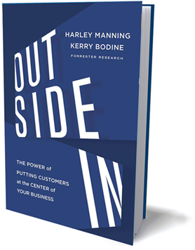
This cover was a struggle. For one thing, there were a lot of people involved: the publisher, Amazon/New Harvest, the two authors (Kerry is very invested in design), and my boss were all involved. I ran the process.
We communicated the ideas we were after, which had to do with looking at the world from the customer’s perspective. I thought this one would be a snap, since the words “Outside In” have an obvious graphical power.
Even so, the publisher’s first round of covers (about five) were all sort of flat and communicated nothing about the book. We sent those back and got a second round of similarly awful covers. I was beginning to panic and actually looked into rejecting the publisher’s designs and hiring Stephani to do the cover for us.
Finally, on the third round, they sent us this cover, which really pops (and also fits nicely with the other two Forrester book covers). It has an Alfred Hitchcock vibe and sort of invites you to think differently about your products, processes, and customers.
One thing I learned here was this: if the designer sends you five covers, they’re probably not that great. If they send you one or two, they’re probably better.
The Mobile Mind Shift
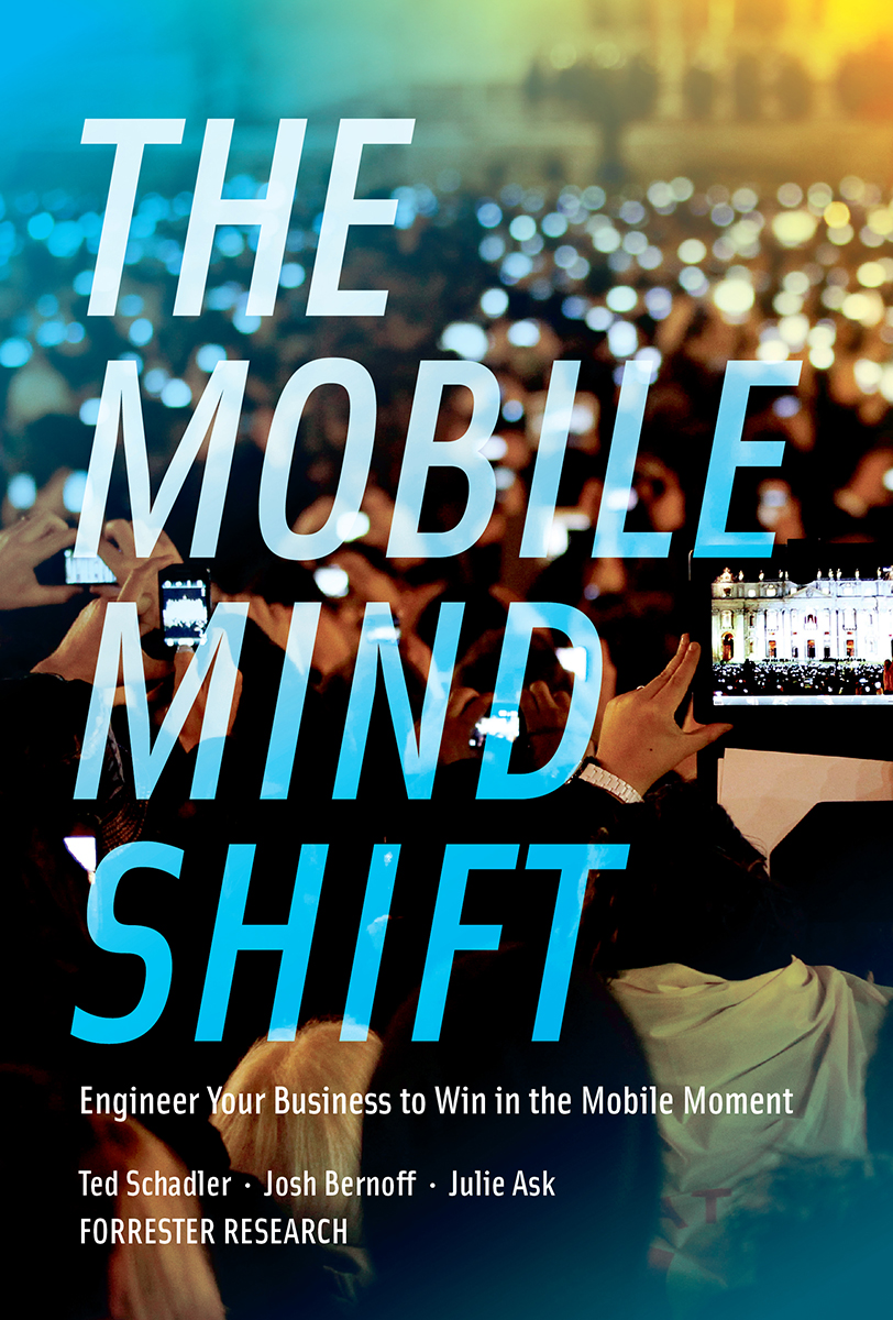
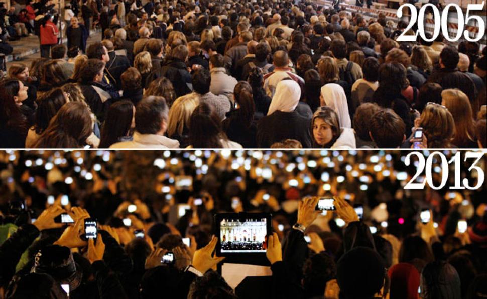
I wanted to see if we could do this book in-house, so I worked with Forrester’s own designers on it. We got plenty of time to speak with them about graphical ideas. This is one case where we shared a graphical element with them: this photograph of the pilgrims in St. Peter’s Square when the new pope was chosen, a photo which had been circulating around the Internet as an iconic example of the ubiquity of mobile devices.
 Forrester’s design team sent us a bunch of ideas, most of which didn’t use the photo. But Ted, Julie and I were in love with the photo, and we picked this cover.
There’s a lot more going on on this cover than there appears to be. The designer used a color shift on the background to subtly draw your eye downward. He positioned and cropped the photo to put the tablet — with the whole scene repeated — so that it drew attention to the title rather than competing with it. And because of that cropping, there was not enough photo to wrap around the whole book. He solved that problem by shading the photo into solid colors for the back and flaps. Overall, it was a masterful example of how designers solve problems with all the tools available to them.