The government’s climate change report features meaty data but a squishy summary
The National Oceanic and Atmospheric Administration and several other government organizations are completing a report on global climate science. Someone leaked a late draft to the New York Times, which published it. The 545 page report is a great case study on how (and how not) to summarize technical information. The executive summary features telling statistics, but it’s too long and full of too many vague statements.
How to summarize
Here’s the mistake most people make in summaries: They summarize. That is, they attempt to write general statements that homogenize specifics in the full document. This results in a weaselly, squishy summary that basically says “trust us, this is the general thrust of what’s in here.” Since many people only read the summary, they miss the specific statistics and facts that make the report believable.
A great summary samples the best results from the full document. It should tantalize you by promising more, but give you facts that will leave you smarter.
Here’s an analogy: Imagine that you’re making a stew. You chop up a bunch of potatoes and carrots, slice up some meat, add some pearl onions, and put the whole thing a slow cooker. How will you give us a taste of your stew? You could put a cup of this stuff in a Cuisinart and blend it to puree — and end up with a bland, homogeneous mixture. Or you could just give us a tablespoonful, allowing us to taste an onion, a piece of carrot, a piece of meat. That one tablespoon doesn’t represent the whole stew the way the puree does, but it promises a lot more.
And summaries should be short. It doesn’t matter whether your document is seven pages long or 500 pages — summarize it in a page and half. Yes, you’ll leave things out, but you’ll make it possible for somebody with only a few minutes — like an executive — to learn something important.
This report features much throat-clearing before we get to the telling details
The climate change report starts with these elements:
- Title page. The title page lists 44 authors.
- Table of contents. This is one page, listing 15 chapters and 4 appendices.
- About this report. This two-page description explains who created the report, why, and how, and describes the sources of information. It starts with “As a key input into the Fourth National Climate Assessment (NCA4), the U.S. Global Change Research Program (USGCRP) oversaw the production of this special, stand-alone report of the state of science relating to climate change and its physical impacts. The Climate Science Special Report (CSSR) serves several purposes for NCA4, including . . . ” Important information, but guaranteed to put you to sleep.
- Guide to the report. These eight pages describe what’s in the report, providing a sort of navigation guide that doesn’t get into any statistics or findings. This begins with “The following describes the format of the Climate Science Special Report and the overall structure and features of the chapters” (a guide to the guide!) and continues to describe what the executive summary is and what the chapters are — not what each chapter contains, but what it means to be a chapter in this report.
- Executive summary. The actual executive summary is 21 pages long and includes an introduction and dozens of sections and subsections.
That’s 12 pages of throat-clearing and and 21 pages of summary. This is intimidating. The content should begin on page 3, not page 13. Why do I have to hack away at all these weeds before reading anything of substance?
The title is sleep-inducing; it should be substantive
Here’s the report title:
U.S. GLOBAL CHANGE RESEARCH PROGRAM CLIMATE SCIENCE SPECIAL REPORT (CSSR)
That’s seven nouns in nine words. Impenetrable. It sort of tells you what the report is, but now what it says. Here’s a better title:
U.S. Climate Science Special Report: Global temperatures, already up 1.6°F, will rise another 2.5°F by 2040
The title should be a headline, and it should include the most important statistic. That invites people to read on, and reflects the hard work of all the scientists involved in this report.
The summary starts with squishy weasel words
The closest thing to a true executive summary in this report is the introduction to the summary. Here are the first substantive words in the report.
Introduction
New observations and new research have increased scientists’ understanding of past, current, and future climate change since the Third U.S. National Climate Assessment (NCA3) was published in May 2014. This Climate Science Special Report (CSSR) is designed to capture that new information, build on the existing body of science, and summarize the current state of knowledge.
Predicting how climate will change in future decades is a different scientific issue from predicting weather a few weeks from now. Weather is what is happening in the atmosphere in a given location at a particular time—temperature, humidity, winds, clouds, and precipitation. Climate consists of the patterns exhibited by the weather—the averages and extremes of the indicated weather phenomena and how those averages and extremes vary from month to month over the course of a typical year—as observed over a period of decades. One can sensibly speak of the climate of a specific location (for example, Chicago) or a region (for example, the Midwest). Climate change means that these weather patterns—the averages and extremes and their timing—are shifting in consistent directions from decade to decade.
The world has warmed (globally and annually averaged surface air temperature) by about 1.6°F (0.9°C) over the last 150 years (1865–2015), and the spatial and temporal non uniformity of the warming has triggered many other changes to the Earth’s climate. Evidence for a changing climate abounds, from the top of the atmosphere to the depths of the oceans. Thousands of studies conducted by tens of thousands of scientists around the world have documented changes in surface, atmospheric, and oceanic temperatures; melting glaciers; disappearing snow cover; shrinking sea ice; rising sea level; and an increase in atmospheric water vapor. Many lines of evidence demonstrate that human activities, especially emissions of greenhouse (heat-trapping) gases, are primarily responsible for recent observed climate changes.
This summary should begin with the lead, which is the 1.6°F temperature rise. Instead, we have to read about what the report is, and the difference between weather and climate — supporting materials that are not important enough to be here at the top. Even after this, we get a slew of weasel words: “many,” “abounds,” “thousands,” “increase,” “many lines of evidence,” “especially,” and “primarily.” This is a criminal waste, because there is a massive amount of specific and easily understood climate information in the rest of the report. The authors of this report have pureed those statistics and turned them into squishy, general statements that have no actual meaning.
The rest of the long summary features meaty bullets and graphics
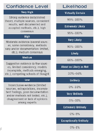
To understand the rest of the content, you need to know the difference between likelihood and confidence. The report explains this with a helpful graphic (the most interesting part of the long “About this report” section”).
The sections that follow this in the executive summary feature meaty bullets full of significant statistics. Here are a few of these:
- Global annual average temperature, measured over both land and ocean, has increased by more than 1.6°F (0.9°C) from 1880 through 2015 (very high confidence). Longer-term climate records indicate that average temperatures in recent decades over much of the world have been much higher than at any time at least the past 1700 years (high confidence).
- Many lines of evidence demonstrate that human activities, especially emissions of greenhouse gases, are primarily responsible for observed climate changes in the industrial era. There are no alternative explanations, and no natural cycles are found in the observational record that can explain the observed changes in climate (very high confidence).
- The likely range of the human contribution to the global mean temperature increase over the period 1951-2010 is 1.1° to 1.3°F (0.6° to 0.7°C) which is close to the observed warming of 1.2°F (0.65°C) over this period (high confidence). It is extremely likely that most of the global mean temperature increase since 1951 was caused by human influence on climate (high confidence). The estimated influence of natural forcing and internal variability on globally and annually averaged temperatures over that period is small (high confidence).
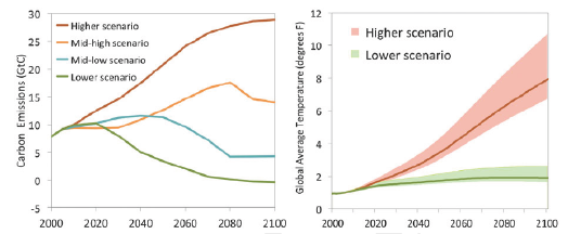
The executive summary sections also include some fascinating and detailed graphics. For example, here’s a graphic illustrating the projected future of greenhouse gases and their effect on climate. (Apologies for the low resolution; this comes from a scanned document.)
This document took years to create and clearly reflects an enormous investment of scientific and political effort. The additional effort required to create a proper summary is much smaller, but it would have created a much higher-impact report that would reward a few minutes concentration with actual knowledge and data. Getting the information out of this report shouldn’t be so hard. The “executive summary” that is here would be far more effective there was a proper page-and-a-half long summary in front of it.
What this document teaches you about summaries
Here’s what you can learn from this:
- Put the most important message in the title.
- Put the executive summary at the front, before everything else.
- Keep the executive summary to a page and a half, regardless of the length of the report.
- Put the headlines and statistics as close to the front of the summary as possible.
- Avoid summarizing statistics with weaselly generalizations. Instead, sample the most relevant statistics and present them numerically.
The quality of your summary makes all difference in the impact of your document. Invest the effort to get it right.
I downloaded the fifth draft and read the first 20 pages. The amount of politicized propaganda, deception, and outright fraud in a report my tax dollars helped fund, as James Comey might say, made me more than a little nauseous.
For example:
“and the frequency of heat waves has increased since the mid-1960s”
Why would anyone ignore the extreme heatwaves of the “low CO2” 1930s and make such a statement? (hint – intentional deception).
https://www.epa.gov/climate-indicators/climate-change-indicators-high-and-low-temperatures
The, uh, “report” is full of that kind of $tuff (at least the first 20 pages, ralph). Here’s a more complete critique:
https://youtu.be/BoaLEDgeR1c