Fivethirtyeight.com reveals the whole election in one gutsy graphic
This is a puzzling election to understand, with unconventional candidates, unusual voting patterns, and hundreds of fluctuating polls. One site does the best at tracking the race (as opposed to the candidates and issues): Nate Silver’s fivethirtyeight.com. And one very strange graphic on that site shows exactly what’s happening, what matters, and what’s changing.
Here it is (as of this morning):
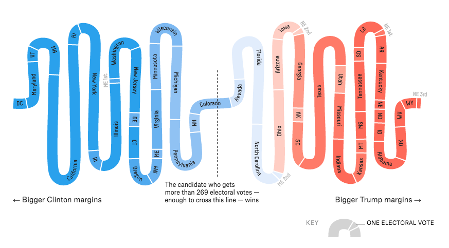
It looks like somebody’s intestines, doesn’t it? But let me explain what’s going on here, and why this is the one chart that best encapsulates the state of the whole election.
How fivethirtyeight predicts elections
Nate Silver and his team have build a model of the election (or, to be exactly accurate, three variants on such a model). The inputs into the model are polls: national polls and, especially, statewide polls. Based on past history, fivethirtyeight scores these polls on quality and adjusts them for “house effects” — that is, whether they’re consistently more favorable to one candidate or the other. The model also accounts for the demographic makeup of states, correlations between states, and in one variant, macroeconomic effects. The site then runs 20,000 election simulations based on the known information and random variation and generates a winning percentage for each candidate in each state.
Why this serpentine graphic is the best way to show the results
Once the whizzes at fivethirtyeight have their information, they can predict the winning percentage for each candidate and even the number of electoral votes each will get, with allowances for uncertainty. Because of the way the US electoral system works, the results of the election depend on 56 separate races that each represent a different number of electoral votes (50 states and DC plus the congressional districts in Maine and Nebraska, for reasons too obscure to go into here). Visualizing all of those states and what they mean is a challenge.
In the serpentine graphic, each state’s segment has a length proportional to the number of electoral votes. The site sorts them from left to right, with the states that have the largest projected margin for Clinton on the left, and those most likely to vote for Trump on the right. The colors represent the margin that that the model projects: solid blue is a certain Clinton win, while pale blue represents a narrow margin for her. And as the callout says, the candidate who crosses the line to get 270 of the 538 possible electoral votes wins the election.
It’s ugly, I’ll grant you that. But I’ve grown to love it, because it’s so revealing. It doesn’t even look like guts to me any more. Here’s what makes it a great data visualization.
- The left-to-right sort reveals the makeup of the nation. Any Democratic presidential candidate can count on DC, Maryland, and Vermont, while Republicans own Wyoming, West Virginia, and Oklahoma.
- It shows where the battle is being fought. Nevada, Florida, North Carolina, and Ohio are in play; where they go determines the election. The chart draws your attention to the middle, which is exactly where the candidates are wrestling right now.
- It avoids geographic distortion. On maps, bigger things look more important. Any map of the US, colored by states, makes it look like Republicans rule the nation because they dominate big, low population states like Montana, the Dakotas, and Wyoming. This chart shows how much more important California, New York, and Texas are, proportionally, in influencing the election.
- Its colors are consistent. Throughout the fivethirtyeight site, Democrats are blue and Republicans are red. The only places the site uses other colors is for third-party candidates like Gary Johnson, Jill Stein, and Evan McMullin. The decades old red state/blue state convention gives readers something familiar to relate to. Sites that use yellow for toss-ups, for example, destroy the graphical consistency that makes everything on this site hang together.
- It’s dynamic. While the shape of this graphic remains the same, its conent shifts over time. In the last week, Trump’s improvement in the polls has made several states like Florida and North Carolina paler, and in some of fivethirtyeight’s models they are now pale pink. You get the impression of forces pushing from either end and fighting in the middle, and you see the results as numbers shift. (I’d love to see an animation showing how it has changed over time.)
- It tells you what to watch on election night. If any states in the middle of this chart — roughly, from Minnesota to Utah — go a different direction than the chart shows, that’s a pretty strong indicator of how the election has differed from the polls. The pale blue color of Nevada, Florida, and North Carolina shows just how close the election is, and how it could easily tip in Trump’s direction with a shift in a few states.
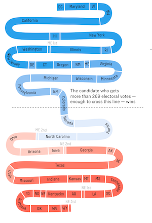
- It even works in mobile. Here’s the vertical version of the same chart from my iPhone.
Some graphics that don’t work as well
Here are some more data visualizations from fivethirtyeight and other sites, with the reasons I haven’t picked them as the best one of this election.
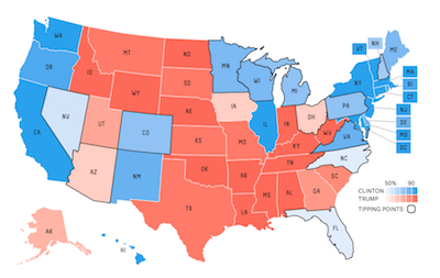
- Fivethirtyeight’s map view keeps the consistent color coding and shows geographic trends. But it distorts the importance of big low-population states, and the outline convention makes it hard to pick out swing states.
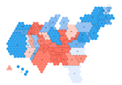
- Fivethirtyeight’s proportional chart eliminates the geographic distortion, but it’s even uglier than the guts chart. It really doesn’t give you a sense of what’s happening. I don’t recognize the shape of the U.S. here.
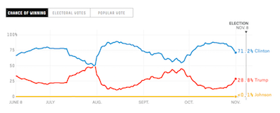
- Fivethirtyeight’s chance of winning chart shows the one number that people care most about. You can see how Clinton’s lock on the election is weakening. But one number doesn’t tell what really matters, which is the swing state races.
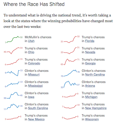
- The New York Times‘ chart of where things are shifting rewards close attention, but it’s hard to get an overview of the trends from this chart.
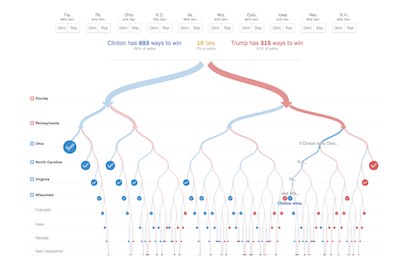
- The Times also shows you a decision tree with every way a candidate can win in one chart. As you might expect, it’s impossible to comprehend. But it is dynamic and fun to play with.
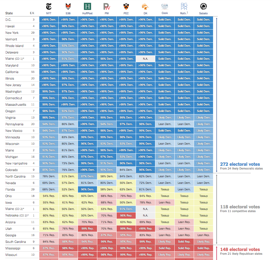
- The Times’ comprehensive chart of everybody’s predictions deserves praise for being inclusive. But it’s tough to scan. The key points here are the numbers in the middle of the yellow boxes, but you have to pay close attention to see what they might mean, and good luck seeing how things are changing day to day. (I cut off the bottom of this chart; it was just too big to see all at once.)
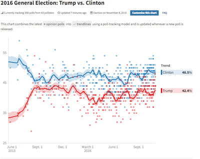
- The Huffington Post’s poll average does a fair job of showing the great diversity of national polls, along with estimated averages and uncertainties (shown by shading). It’s a fair way to see the popular vote trends, but the popular vote by itself won’t determine who wins the election.
What’s your favorite election graphic? Post a link to it in the comments.
One Comment